Notice:
This post is older than 5 years – the content might be outdated.
In the past few years a recognizable trend of single page websites emerged (not to be confused with the term ‘single page application’). These sites consist of mainly one large page where the users’ most important navigation tool is scrolling. Classic examples can be seen on apple.com/mac and duracellenergybank.com. Similar to watching TV and zapping through the channels, single page websites are typically simply structured and intuitive to understand.
In addition to such single paginated articles, image carousels represent a common UX pattern, where scrolling can be used to slide between the images.
Introduction
Scroll snapping is a method of defining snap points to tell the browser where it should stop scrolling. The process of snapping to the edge of an element (e.g. section, image, box, etc.) when coming close to it is used in order to achieve optimized scrolling positions by preventing unwanted elements from projecting into the current view, reducing the screen space by their cut-off contents. (There are some situations though for which the other elements‘ edges indicate what comes next. This can be seen later in this article.)
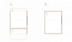
As the image above illustrates, scenario A shows a view where the user has scrolled over elements and stopped at a position where several content sections can be seen. This is the default browser behavior which can be found on almost all informative websites, such as blogs, e-shops, tools, etc.
But when it comes to pages where single steps are presented to the user one at a time, especially with single page websites, it is good practice to let the browser snap to the edge of an element as the user scrolls.
In scenario B, only one step is visible and no parts of adjacent sections can be seen. Check out this interactive demo:
The new CSS Scroll Snap standard helps web frontend developers to create precisely controlled scroll experiences by defining the scroll snapping positions.
Wait! Did I read that correctly? Changing the behavior of scrolling?! ?
Yes, that’s right. The good news is that the new CSS Scroll Snap standard differs from other JS scrolling libraries in that it does not interfere with the scrolling operation directly, but only watches for defined snap points. This means the scrolling interface you build is going to feel just like the native interface on whatever platform it is viewed on.
Scroll snapping happens after all other scroll operations, including those initiated by scripts.
But: the use of this feature must be well thought-through, see the section ‘When to use it’ below.
Usage
You can find all relevant information about how to use scroll snapping on CSS-Tricks and Google Developers. A more detailed documentation can be found on the W3C Recommendation Draft.
On caniuse you can find information about browser-support and known issues. Additional, a polyfill can be found on npm.
When to use it?
This feature is definitely for specific use only! You should not define snapping points all over your layout and let the browser magically snap to all kinds of edges.
What are the Main Use-Cases?
As explained in the motivation section, the most common use cases are carousels and single page websites. Whenever it is important to focus on one thing at a time, scroll snapping might be a solution to improve the usability.
Without scroll snapping, focusing on one part at a time can be achieved by having multiple views for each step. For example when the user needs to fill out a form which is divided into several parts, such as checkout procedures of online shops.
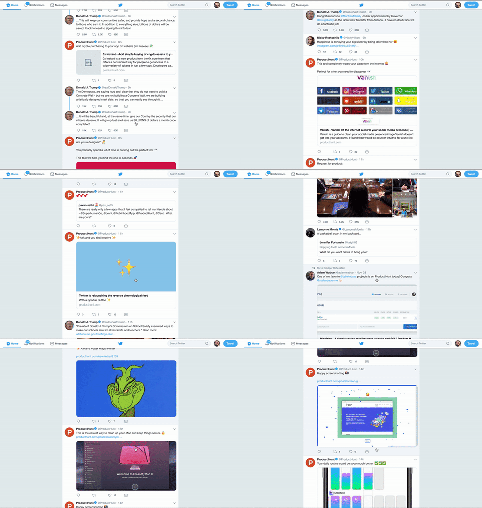
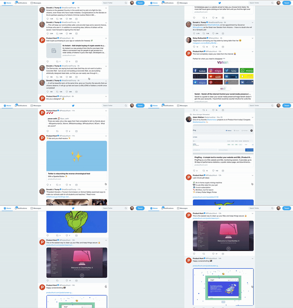
It could also be more convenient to let posts of news and social media pages snap. In the following example you can see how this would look for Twitter.
| Normal Scrolling Behavior | With Scroll Snapping for Posts |
 |
 |
I wrote this little Bookmarklet-Snippet for Twitter-Scroll-Snap:
|
1 |
javascript:window.setInterval(function(){document.querySelector('body').setAttribute('style', 'max-height: 100vh; overflow-y: scroll; scroll-snap-type: y proximity; scroll-padding-top: 46px;'); document.querySelectorAll('li.stream-item').forEach(function(x){x.setAttribute('style', 'scroll-snap-align: start')}) }, 2500); |
You just need to create a new bookmark with this code as specification for the Link and click it (every time) after you load the twitter website ?
What are the Usability Advantages?
One advantage is that you can configure the snap points in many ways, generating an individual solution which is best for your website. Because the CSS Scroll Snap method does not directly hijack the scrolling behavior, it is a useful tool to enhance the user experience of your product/site/component.
Whether on mobile or desktop, as the user scrolls through the gallery, the images always stop at a pleasant position.
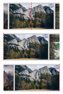
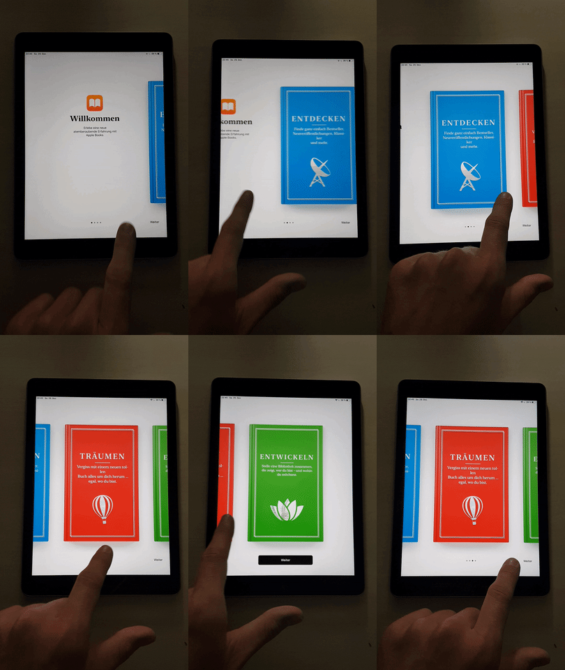
Speaking of mobile, scroll snapping is a long existing core feature of the smartphone or tablet homescreen, where you have multiple horizontally aligned views as shelf spaces for your apps. Also in macOS, switching between multiple desktops, previewing PDF-files and user onboardings are examples where a scroll snapping mechanism is used. So there are a lot of situations in which scroll snapping can be very useful.
Which Flaws Might Come up?
By changing such a fundamental user interaction as scrolling the user can easily be frightened away. The term ‘scroll-jacking’ is common in relation to a bad user experience. CSS Scroll Snap has to be used sparcely and carefully. In general, users don’t like websites that are contrary to their expectations. Such an awkward feeling can be experienced on the presentation site for the new iPad Pro, where Apple intended to be very creative and playful.
- In many situations using this feature can cause rather bad user experience. Even on single page websites, skimming becomes more tricky and cumbersome with scroll snapping activated.
- Developers must be conscious of the issue that some content may become unreachable due to varying-sized sections, explained here on CSS-Tricks.
- Also oversized elements can produce unexpected behavior. For example, if some element has more height than the viewport of the device, it’s hard to see the whole content of that elements’ sections, because the snapping interferes as soon as an edge comes close.
- Keep in mind, that not all visitors use devices that allow smooth scrolling (e.g. Magic Trackpad, Touch-Devices). Regular computer mice work with detents. Users with those devices go through a completely different experience as the scroll goes in discrete steps, resulting in a more wobbly UX.
To see some of the flaws and pitfalls in action, check out this little demo:
Summary
The CSS Scroll Snap feature looks like a promising method for improving the user experience on your website when used wisely. By allowing the browser to hook into the native scrolling interaction with CSS snap points, there are many scenarios where the user’s focus can be controlled more easily.
Further Ideas
The configuration possibilities for this feature currently represent the basic needs only. There could be more helpful settings for creating perfectly fitting solutions. Here are some ideas:
- The time of the snapping process
- What about the timing functions (easing)
- Extending the feature by using JavaScript? Will there be some kind of snap-event to interact with? (e.g. shake the view after snapping)
Given these suggestions, I hope you’ll have fun playing around with the CSS Scroll Snap Feature.
Also check out the compatibility in different browsers:
https://caniuse.com/css-snappoints
Resources and further notes
- CSS Tricks
- Google Developers
- Can I Use
- W3C Definition – Candidate Recommendation
- W3C Definition – Working Draft
- awwwards – Single Page Websites




I have to disagree with part of the article. While scroll snapping can be useful for carousels, applying it to continuous text content like posts or landing pages isn’t bettering UX in any way. Humans do not process images the same way we do text, and while scroll snapping may create more aesthetically pleasing visuals by aligning the pictures, with text it creates a disconnect between where the user expects the text to stop scrolling and where it actually does, disrupting the reading experience.
I disagree
Hi FOX, thanks for reading my article! Could you please try explaining in what you disagree?
Scroling is completely broken under Windows compared to macOS, this might make thing evene more enjoyable.
Hello hANDwASH, thanks for your input.
When I wrote this article 2 years ago, I didn’t even see the horrible nested scrollbars on Windows… I fixed those at least for this Fiddle-Demos.
What you say is true, the fact, that using a mouse wheel with grid rastering totally destroys the UX enjoyment, makes the usage only touch friendly (I tried explaining under the flaws-sections).
This feature can currently only be used for touch devices (mobile or trackpad).
Hey dsp4, thanks for reading my article and commenting on it.
I have to agree with you, that humans process image and text visuals in different ways. What I tried highlighting with the use cases was the separation of contents the user focuses on. Twitter posts are separated in small tweets which can be seen as individual cards, same belongs to instagram which are indeed images combined with text forming a card. Also the onboarding demo represents enclosed steps, each displayed as card with text in it. This could also fit for common checkout wizards.
What the examples have in common is, that they represent small parts of UI-elements or sections which fit on one screen (even mobile sizes) and with the use cases the user wants to focus on one thing at a time.
So, if the part you want your user to focus on is small enough, I think for touch devices (mobile and trackpad) scroll snap can be a good thing.
Great article!
Thank you Lukas 🙂