Whether you are working on the go, catching up on your favorite series, or staying connected when traveling with the Deutsche Bahn, a reliable internet connection is crucial, particularly for travel convenience. Let’s say we are the main data analyst at Deutsche Bahn AG. Our job is to create a compelling narrative based on complex data about the trains and the routers on board to convince the board to invest more money in internet connectivity for the trains. That is what data storytelling is all about and one part of our data story, surely is the question: “How good is the Wifi/WLAN internet connectivity on ICEs?“.
In this blog post, we are getting hands-on. We are building a data app using Streamlit directly from Snowflake on a dataset of the Deutsche Bahn. So, hold onto your seats – it is time to explore the world of data apps with Deutsche Bahn.
For those interested in diving deeper, the complete source code for the project is available on GitHub at https://github.com/inovex/blog-streamlit-wifi-on-ice. Feel free to explore, fork, or contribute to this repository.
But before you board the train, some prerequisites
To implement a Streamlit app in Snowflake, we require the following:
- Snowflake account to access Snowflake with appropriate permissions (CREATE STREAMLIT privilege)
- As we plan to use Streamlit integration, the Snowflake account is required to be located in Amazon Web Services (AWS). Other cloud platforms are not supported yet. More information on this is given here.
- Acquire the Deutsche Bahn open-source datasets via Open-Data-Portal
- Wifi-on-ICE dataset
- Betriebsstellenverzeichnis dataset
Streamlit integration in Snowflake
Streamlit is an open-source Python package designed to facilitate the creation of data applications featuring interactive data dashboards. This tool streamlines the development process for data apps and interactive charts. It offers a variety of user widgets, such as sliders, text input, and buttons, that can be easily assembled into data applications with just a few lines of code.
Since September 2023, Streamlit has been integrated into Snowflake in public preview. This integration offers several benefits, including the ability for developers to securely build, deploy, and share Streamlit apps within Snowflake’s data cloud. It ensures an instant leveraging of data in Snowflake without data moving or a separate hosting environment. As Streamlit’s integration is currently in preview, it should be noted that it comes with a few limitations at the moment:
- There is a data retrieval limit of 16MB for a single query used in a Streamlit app
- A few Streamlit features are not supported. Check them out. Further, Snowflake uses v1.22.0 of Streamlit. Newer versions are (currently) not available.
- The development of apps within Snowsight (Snowflakes web interface) does not provide version control. Each code change will be saved immediately and no app history is memorized.
Snowflake uses a combination of cloud service instances and virtual warehouse instances to run Streamlit apps. Before constructing a Streamlit app in Snowflake, several important considerations must be taken into account to ensure a smooth and cost-efficient experience:
- Concurrency: Snowflake offers session throttling and autoscaling to handle fluctuations in demand for Streamlit apps. It is crucial to consider the constraints imposed by Snowflake, including per-instance, per-account, and per-user limitations on simultaneous Streamlit sessions.
- Billing: When running a Streamlit app in Snowflake, you will need a virtual warehouse for SQL queries and app execution. This virtual warehouse remains active for approximately 15 minutes after the app’s last interaction. Closing the webpage that runs the app will trigger auto suspension of the virtual warehouse.
- Performance: It is recommended to choose the smallest warehouse possible depending on factors like the Streamlit app’s complexity, warehouse availability, latency, and cost.
Preparation and Processing of the Datasets
The “Wifi on ICE“ dataset comprises mobile connection measurements for each of six modems belonging to nearly 250 routers installed in ICEs over a span of 3 days in spring 2017. It contains the number of logged-in devices in the WLAN, as well as the status, latency, and data rates (measured in bytes) of the mobile connections, recorded (in most cases) at 5-second intervals. Each router corresponds to an individual train, and we assume the recordings of one day align with their respective routes.
Before importing the data into Snowflake, we carried out various preprocessing steps to validate that this data supports answering our data story questions. It is worth noting that all of these operations can be performed seamlessly within Snowpark:
- Removal of duplicated recordings for certain modems
- Aggregation from modem to router level
- Summing up the sent and received data rates for each train at each given timestamp.
- Extracting the counts of logged-in devices to the WLAN for each train at each given timestamp.
- Calculating the data consumption per device by dividing the sum of sent and received data rates of the train by the number of devices in the WLAN. It is an indication of the approximate available internet speed for each device at a given timestamp.
- Investigating Wifi disruptions by aggregating modem connectivity. If all modems in a router are disconnected, the internet connection is unstable.
- Averaging the calculated data consumption and count of logged-in devices to the WLAN every 5 minutes for each train.
- Integrating geospatial data
- Joining “Betriebsstellenverzeichnis“ dataset based on the closest distance to identify the nearest start and end station of a route.
- Aggregating the GPS coordinates to calculate center coordinates at 5-minute intervals. This step involves grouping the location data collected within each 5-minute time frame and determining the central location for that specific interval of a route.
- Prepare the data for visualization and the data story
- Converting the data consumption from bytes to Mbit/s provides a conventional measurement unit.
- Cutting the averaged data consumption per device into five categories based on their value. It serves as an indication of very low to very fast internet speed.
- Assigning online activities to each category that are most feasible at each respective data consumption. The idea is to enhance our data story with more concrete illustrations for the data rate consumption.
- Assigning colors to each category for visualization purposes in the planned data app.
- Ensuring that all remaining NaN values are replaced by meaningful values.
The final data frame consists of the following relevant columns:
- “ROUTE“: Start and end station names of the matched route
- “DATARATE_PAX_AUTH“: Averaged data rate consumption per logged-in onboard device. In the following, we will use it as an indication of the available internet speed per device.
- “DATARATE_PAX_CATEGORY“, “DATARATE_PAX_ACTIVITY“, “DATARATE_PAX_COLOR“: Categorization of the data rate consumption per device. For each respective category, feasible online activities and colors for visualization purposes are assigned.
- “TIME_DIFF“: Difference between two consecutive timestamps of a route
- “PAX_AUTH“: Averaged number of logged-in devices
- “WLAN_DISRUPTION“: Indication of stable modem connectivity for a router. If all modems are disconnected, we handle it as a WLAN disruption.
Lastly, the preprocessed data is exported as a CSV file and therefore ready for the Snowflake import.
For this purpose, we navigate to the “Data“ tab on the left in Snowsight. After selecting the desired CSV file from our local source, we simply adjust data formats, delimiters, and other settings to ensure accurate ingestion. Optionally, we might need to select a specific warehouse. For more information, see this documentation.

Building the Streamlit app using Snowsight
Set up a New Streamlit App in Snowsight
There are two possibilities for building and deploying Streamlit apps in Snowflake. The first option involves deploying a locally developed Streamlit app by utilizing SQL. The second option makes use of Snowsight to develop the app in its provided Python editor. It is worth noting that this method has a limitation – it does not support the creation of multi-page apps.
We decided to go with Snowsight: To set up a new Streamlit app in Snowsight, we navigated to “Streamlit“ in the left menu bar, selected “+ Streamlit App“ and provided the name “Wifi on ICE“ for the app. We chose the desired warehouse and app location, a database and scheme, where the app will be created, and lastly clicked on “Create“.
This brought us to the Python editor, which allows us to write, edit, and execute code for your Streamlit app. It offers auto-completion and access to helpful documentation about Streamlit and Snowpark functions. The interface is separated into three parts:
- the object browser to invest accessible databases, schemas, and views
- the Streamlit editor to implement the app code in Python
- the Streamlit preview to see immediately the app running in action. This preview functionality follows Streamlit’s development flow, allowing it “to work in the fast interactive loop“
Design the app
Especially when conveying messages within a data story, it is crucial to consider an appropriate app design. The message carried through data should be easily understandable. To achieve this, we devised a simple design, in which the user can select a specific route a train has taken, as represented in our data. Based on this chosen route, a stacked bar chart illustrates the proportion (in minutes) of feasible Wifi-based activities that travelers can spend their time with on the chosen routes. Further, a map with three visualization layers should provide more details about the internet quality for the selected routes. To optimize the user’s investigation, these layers can be hidden by clicking on three respective checkboxes. We further planned to include an expandable container to give more details of how the displayed data has been calculated and categorized.
Implementation of the app
Import required packages
Streamlit in Snowflake comes equipped with the python, streamlit, and snowflake-snowpark-python packages pre-installed in your environment by default. Other essential packages are supported by the Snowflake Anaconda Channel. These can be simply added through the interface by clicking on the package manager button.
In our case, we require pandas for data manipulation, pydeck for map visualization, and plotly for interactive data visualization, as well as we import a Snowpark function to filter the queried data.
|
1 2 3 4 5 6 7 |
import streamlit as st import pandas as pd import pydeck as pdk import plotly.express as px from snowflake.snowpark.functions import col from snowflake.snowpark.context import get_active_session |
The “get_active_session“ function represents the possibility of accessing the data in Snowflake from the Streamlit app. A connection to Snowflake is established without the need for explicit Snowflake credentials when utilizing this session
Structure of the App
The structure of the main part of the Python script looks like the following:
|
1 2 3 4 5 6 7 8 9 10 11 12 13 14 15 16 17 18 19 20 21 22 23 24 25 26 |
# Get the current credentials session = get_active_session() # Add title and header of the app st.title("🚆 WIFI on ICE") st.header("Making the most of your journey utilizing onboard Wi-Fi") # Load and cache data df = load_data(session) # Provide multiselect for exploring specific routes route = st.multiselect( "Choose a route", sorted(df["ROUTE"].unique()), [] ) df_route = df[df["ROUTE"].isin(route)] st.markdown("___") # Display route specific data # Wifi activities in minutes with st.container(): plot_activites_route(df_route) # Wifi conditions on a map with st.container(): plot_map_route(df_route) get_explanation() |
Our planned data app is built with a few Streamlit function calls. Our own written functions will be shown in the next sections. First, we retrieve the data connection using Snowflake’s “get_active_session“. Then, we set the app’s title and header, providing a clear introduction to the purpose of the app. The data is loaded and cached using the “load_data“ function.
Users can explore specific routes through a multi-select option, which is set up by a simple Streamlit function “st.multiselect“. It is an input widget, showing all available routes of our dataframe, and returns a list of all chosen routes. This list is used to filter the entire dataset. The selected route’s data is filtered and displayed. Two separate Streamlit containers are used for layouts to integrate two plots: Wifi activities in minutes using the “plot_activities_route“ function and a map displaying Wifi conditions is presented through the “plot_map_route“ function, while further explanations can be obtained with “get_explanation“.
Data Loading
Next, we implement a function that will load our beforehand imported Wifi data using an established session:
|
1 2 3 4 5 6 |
@st.cache_data def load_data() -> pd.DataFrame: data = session.table("STREAMLIT_WIFI.BLOG.WIFI_ON_ICE").filter(col('DATARATE_PAX_ACTIVITY') != 'no value') return data.to_pandas() |
We employ a Snowpark function directly after querying the data to filter out samples where no measurements have been recorded. Additionally, it is crucial to utilize Streamlit’s built-in caching mechanism to enhance the app’s performance. For that, the function is decorated with “st.cache_data“. Even if the entire Python script reruns after each user interaction or code change, the execution of the data-loading function will be skipped and the cached result will be returned.
Interactive Bar Chart to Display Online Activities
To visualize the feasible internet activities a user can engage in at a given internet speed for selected routes, we have implemented an interactive stacked bar chart using Plotly. This chart showcases the total minutes travelers have spent on various internet activities. The core of this function can be found in the following steps:
- Formulating a subheader to provide context
- Constructing a grouped data frame that calculates the sum of minutes for each activity group of a specified route
- Constructing the Plotly bar chart. The data frame, now containing the aggregated data, is used as an argument, which is easily plotted via Streamlit using a single Streamlit function “st.plotly_chart“.
|
1 2 3 4 5 6 7 8 9 10 11 12 13 14 15 16 17 18 19 20 21 22 23 24 25 26 27 |
def plot_activites_route(df_route: pd.DataFrame) -> None: # Add subheader st.subheader('💻 Explore *WIFI on ICE* enabled activities for your route') # Sum minutes for each activity group df_activity = pd.DataFrame( df_route.groupby(['DATARATE_PAX_ACTIVITY']).agg({ 'TIME_DIFF': lambda x: x.sum()/60 # transform seconds to minutes })).reset_index() df_activity["GROUP"] = 0 # assign identical group for showing one bar # Prepare plotly bar chart fig = px.bar( df_activity, y="GROUP", x="TIME_DIFF", ..., color="DATARATE_PAX_ACTIVITY", orientation="h", title="Activities summed in minutes", width=700, height=320 ) ... # Plot plotly chart in Streamlit st.plotly_chart(fig) |
Interactive map to visualize WLAN conditions in geospatial regions
For this, we require two functions. The “get_pydeck_layers“ function serves the purpose of providing a dictionary of Pydeck layers for visualizing data related to internet speed, the number of recorded devices, and Wifi disruptions on a map. It takes the filtered “df_route“ data frame, as an input and returns these Pydeck layers:
- “Internet Speed“: A LineLayer that displays internet speed connections between consecutive measurements of a route, with color-coded data identical to respective internet activities.
- “Amount Devices“: A ColumnLayer presenting the number of devices with elevation scaling.
- “Wifi Disruptions“: An ArcLayer that visualizes Wifi disruptions on the route.
|
1 2 3 4 5 6 7 8 9 10 11 12 13 14 15 16 17 18 19 20 21 22 23 24 25 26 27 28 29 30 31 32 33 34 35 36 37 38 39 40 |
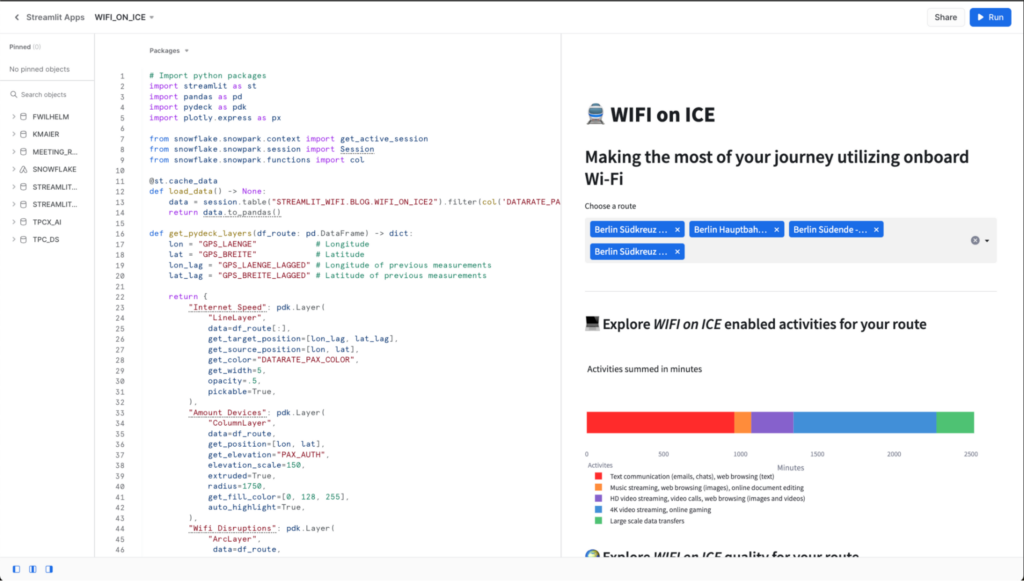
def get_pydeck_layers(df_route: pd.DataFrame) -> dict: lon = "GPS_LAENGE" # Longitude lat = "GPS_BREITE" # Latitude lon_lag = "GPS_LAENGE_LAGGED" # Longitude of subsequent measurements lat_lag = "GPS_BREITE_LAGGED" # Latitude of subsequent measurements return { "Internet Speed": pdk.Layer( "LineLayer", data=df_route, get_source_position=[lon, lat], get_target_position=[lon_lag, lat_lag], get_color="DATARATE_PAX_COLOR", get_width=5, opacity=.5, pickable=True, ), "Amount Devices": pdk.Layer( "ColumnLayer", data=df_route, get_position=[lon, lat], get_elevation="PAX_AUTH", elevation_scale=150, extruded=True, radius=1750, get_fill_color=[0, 128, 255], auto_highlight=True, ), "Wifi Disruptions": pdk.Layer( "ArcLayer", data=df_route, opacity=0.5, get_source_position=[lon, lat], get_target_position=[lon_lag, lat_lag], get_source_color=[255, 0, 0], get_target_color=[255, 128, 0], get_width="WLAN_DISRUPTION*15", pickable=True, ), } |
The “plot_map_route“ function calls the “get_pydeck_layer“ function. It is designed to offer an interactive experience to the user, allowing them to choose which Pydeck layers to display on the map. Here is how it works:
|
1 2 3 4 5 6 7 8 9 10 11 12 13 14 15 16 17 18 19 20 21 22 23 24 25 26 27 28 29 30 31 32 33 34 |
def plot_map_route(df_route: pd.DataFrame) -> None: st.subheader('🌍 Explore *WIFI on ICE* quality for your route') # Display an interactive map to visualize average datarate, amount of devices, and wlan disruptions st.caption("Map Layers") cols = st.columns(3) layers = get_pydeck_layers(df_route) # Collect selected layers selected_layers = [layer for i, (layer_name, layer) in enumerate(layers.items()) if cols[i].checkbox(layer_name, True) ] # Plot layers on map if selected_layers: st.pydeck_chart( pdk.Deck( map_style=None, initial_view_state={ "latitude": 51.1642292, "longitude": 10.4541194, "zoom": 4.5, "pitch": 35.5, }, layers=selected_layers, tooltip={"html": "Avergae Datarate: {DATARATE_PAX} " "Average Datarate per Device: {DATARATE_PAX_CATEGORY} " "Average Devices amount: {PAX_AUTH} " }, ) ) else: st.error("Please choose at least one layer above.") |
Three checkboxes are created that are laid out as side-by-side columns. Each of the checkboxes is related to a Pydeck layer. With each user interaction as selecting a checkbox, the chosen layers are collected in a list. This list is then used as an argument in the Pydeck function call via Streamlit “st.pydeck_chart“. If no map layer is selected at all, the function makes use of Streamlit’s error message feature “st.error“ to guide the user.
To enrich our data app with further information, we simply use another multi-element container that can be expanded with “st.expander“. The essential part of the implementation can be found in the following code snippet.
|
1 2 3 4 5 6 7 |
def get_explanation(): with st.expander("ℹ️ See further information"): st.write( """ .... """ ) |
Run the data application
After putting everything together, the application can be started by clicking on the Run button located at the top right corner.
The application looks like this for four chosen routes starting in Berlin (Berlin – Hamburg, Berlin – Cologne, Berlin – Frankfurt am Main, Berlin – Munich).


Map visualization of the data app with three layers selected.
Data Story Insights Behind our Completed Streamlit App
Violet, blue, and green colors predominantly indicate segments along the actual route of the ICEs on the map, as opposed to parking zones shown in red in city areas. It means that passengers on the actual journey have at least 10 MBit/s data rate which is connected to internet activities like video streaming, video calls, web browsing, and online gaming. Although a significant amount of the time in the bar chart (1000 minutes) involves respective poor internet experiences such as text messaging with a data rate lower than 10 MBit/s, this is mainly due to lower data rates being recorded in parking zones and does not apply to the actual journey and the travel experience. Therefore, we observe small portions of orange and red lines to indicate this lower MBit/s rate in city areas. Further, we also encountered some Wifi disruptions along the route in rural regions before Frankfurt and Munich, where connectivity breakdowns limit the fun of internet surfing. The elevation bars at each location show the number of devices logged in the onboard WLAN. A decrease in logged-in devices can be seen close to final destinations as well as in the parking zones of the trains.
While our dataset did not provide information about how many of the logged-in users surfed, we assumed that the majority of them used the Wifi during the journey. Further, the data does not reveal when the ICE is on its ride on its actual route. Notably, when the train was in its parking position, we observed a significant number of recordings with very slow internet speeds. Most likely, the ICE crew is logged in without active internet use in parking zones before and after the actual journey. Similarly, passengers tend to finalize their belongings and largely discontinue internet usage shortly before arriving at their final destination. This explains the large red part in our bar chart, which is also visible in city areas on the map. However, it is important to emphasize that for the majority of the actual journey, a good internet speed was guaranteed, allowing for activities such as video streaming and online gaming during the train ride using the onboard Wifi. As a traveler on the ICE, this generally should ensure a pleasant surfing experience and make travel convenient.
Conclusion
In conclusion, our data-driven journey through “Wifi on ICE“ has provided us with valuable insights. By utilizing Streamlit and Snowflake, we were able to create a user-friendly data app that allowed us to analyze the internet speed experienced by travelers.
This project serves as proof of the power and simplicity of combining Streamlit and Snowflake for data app development. We found that these tools offer a fast and straightforward way to build data apps, thanks to the intuitive Streamlit API and its comprehensive documentation. The integration with Snowflake allows for creating value directly from the data and easy testing and immediate visibility of changes in the running app which makes it fun to build apps for data stories.
References
- https://docs.snowflake.com/en/developer-guide/streamlit/about-streamlit
- https://docs.streamlit.io/
- https://data.deutschebahn.com/dataset.groups.datasets.html
- https://quickstarts.snowflake.com/guide/getting_started_with_snowpark_for_python_streamlit/index.html#0
- https://www.businessinsider.de/tech/eine-karte-zeigt-wie-schnell-das-wlan-in-den-ices-der-deutschen-bahn-ist-2018-5/